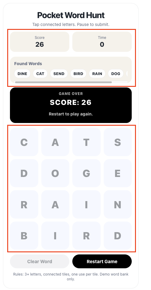
Pocket Word Hunt
Tap connected letters. Pause to submit.
Found Words
Rules: 3+ letters, connected tiles, one use per tile. Demo word bank only.
2026
Pocket Word Hunt
Overview
Pocket Word Hunt is a browser-based word game built to test how quickly a simple product idea could move from concept to playable experience. The game was designed to live directly inside a Squarespace portfolio site without a backend, app deployment, or external dependencies.
Rather than treating the project as a full production build, I used it as a rapid prototyping experiment to explore gameplay design, frontend implementation, and AI-assisted product development.
Goal
The goal was to prove that I could turn a small product idea into a working interactive experience using a lightweight PRD, browser-native code, and fast iteration.
The prototype needed to demonstrate the core gameplay loop: players select adjacent letters, form words, receive feedback, earn points, and race against a timer.
My Role
AI-Assisted PRD + Build + Workflow · Product Design · Game Design · Rapid Prototype · UX/UI · Creative Direction
Process
I started by creating a focused PRD that defined the gameplay loop, MVP scope, technical constraints, and edge cases. From there, I moved directly into prototyping with HTML, CSS, JavaScript, and Squarespace embeds.
The process followed a simple build-test-refine loop:
Define the interaction
Build the first version
Test inside Squarespace
Identify friction
Simplify the experience
Refine the interface
ChatGPT supported the workflow by helping structure requirements, generate gameplay logic, debug frontend behavior, refine UI patterns, create the app icon, and shape the final case study narrative.
What I Built
The final prototype includes:
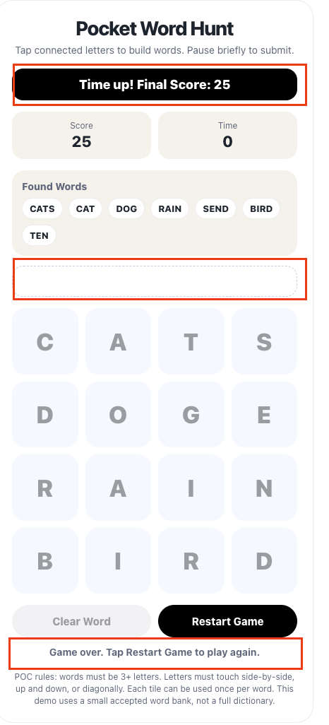
4x4 interactive letter grid
Adjacency-based word building
Auto-submit word validation
Score tracking
Countdown timer
Clear Word button
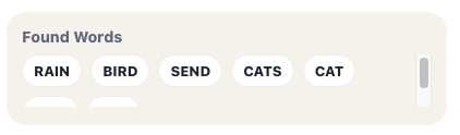
Found Words carousel
Mobile-friendly responsive layout
Curated demo word bank
Single-code-block Squarespace embed
To keep the build simple and portable, all game logic stayed client-side. I did not use frameworks, authentication, persistent storage, or a backend.
Key Design Decisions
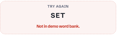
Clearer Word Validation
During QA, I noticed that some real word attempts, like “SET,” were rejected because they were not included in the prototype’s demo word list.
To make this feel less like an error, I updated the message to “Not in demo word bank.” This makes the limitation clear: the game uses a curated demo vocabulary, not a full dictionary.
Consolidated Feedback
Earlier versions had separate areas for the current word, gameplay messages, and final score. This made users look around the screen for related feedback.
I replaced those separate elements with one status panel above the grid. The panel now handles current word, valid word feedback, invalid word feedback, duplicate word messages, game-over state, and final score.
Stable Gameplay Layout
The Found Words and feedback areas originally expanded during play, which pushed the letter grid down and made the main interaction area feel unstable.
I redesigned these sections with fixed-height containers and turned Found Words into a horizontal carousel. This allowed new words to appear from the left while keeping the board locked in place and easy to use.
Refined Visual Hierarchy
I simplified the visual system so each color had a clear role:
Light gray: supporting panels and inactive tiles
Dark gray: readable tile text
Black: selected tiles, game-over state, and primary restart button
This helped the interface feel calmer, clearer, and more intentional.
Challenges and Tradeoffs
aria-livearia-labelaria-pressedAccessibility Improvements
Outcome
Pocket Word Hunt evolved from a rough playable POC into a cleaner and more intentional web game experience. The final prototype demonstrates the core gameplay loop, works inside Squarespace, and feels stable enough to present as a portfolio experiment.
More importantly, the project validated a fast workflow for turning a small idea into a functional product experience through product thinking, rapid iteration, and AI-supported implementation.