Smart Family
Verizon | 2018
Verizon’s Smart Family app allows parents to manage their kid’s tech usage and keep an eye on them even if they’re not together.

Business Goals
At the time, Verizon’s Smart Family needed to increase revenue through purchase of the Smart Family or Smart Family Premium service.
ROLE
Senior Product Designer
SKILLS
UX Design
Prototyping
UI Design
TOOLS
Sketch
Invision
Amplitude
THE PROBLEM
Our data shows that many users drop off after seeing the Verizon Smart Family plan selection. Our next steps were to understand the reason why users abandon this page.

USER TESTING
User testing was conducted on 10 users online. The users were selected based on demographics that resonated with our target audience. These tests were conducted on iOS and Android users.
The user testing was conducted to derive learnings in the following areas:
Understanding of key value propositions offered by the app/service
Comprehension of the difference in tiered plans
USER PAIN POINTS
What we learned from the plan selection page
– During on boarding, the app showcases the service selections with descriptions in paragraph format. Users were not able to easily and quickly distinguish main features and highlights of the app from the 2 options.
– Users didn’t realize that they would receive 30 day free trial from this page.
SOLUTIONS
HypothesEs
We believed that in order for parents to:
easily and quickly read through the benefits and features of the different plan for Smart Family, we put them into a list view.
easily digest and memorize, each feature are described with a short copy.
fully understand the most important features, we added additional features that were not there before and are relevant to the business within the comparison chart.
see available features related to each plan, we added check marks/iconography next to each feature.
2 wireframes were put together to illustrate these hypotheses with different interactions.
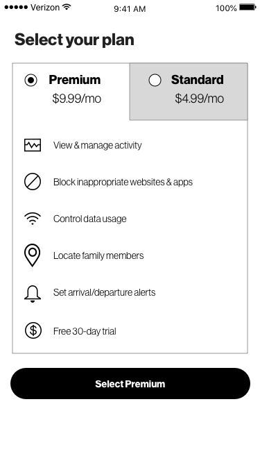
VERSION 1 shows a comparison chart with check marks showing availability of features/benefits of each plan with shortened copy.
VERSION 2 shows a tabbed version. Each tab showing features and benefits that is offered for each plan.
VERSION 1


VERSION 2

USER TESTING SOLUTIONS
VERSION 1 & 2 FINDINGS
+ It was clear to users how to select each plan.
+ Users found value in each of the features and benefits.
+ Most users chose premium, many without clicking the other radio button because the plan descriptions were clear.
– Some switched between options to see if there’s anything that would change, adding interaction cost. However, users were able to compare and decide on the best plan for them and their family.
Quotes
“The comparison is clear. I want to try the premium plan because it has all the features I need.”
“I like this because it’s obvious that the grey check marks are not what the 4.99 plan covers”
ADDITIONAL LEARNINGS
Users were selecting a plan slower on Version 2, compared to Version 1. They would spend time tapping on the tabs to compare features/benefits.
RESULT
VERSION 1 was chosen by the team because it did not require users to go into a second page to learn more about the features of the following plan.
VERSION 1 showcased a lower interaction cost than Version 2.
