
How we turned one of our messiest UI components into a scalable design system foundation
The Problem
Over time, buttons became one of the largest sources of design and tech debt across the product.
Different teams introduced new button styles to solve local problems, resulting in inconsistent hierarchy, unclear semantics, and repeated implementation work.
Internally, this fragmentation was referred to as “Button Hell.”
Before: 30+ button variants across teams
The Result
Consolidated dozens of inconsistent button styles into a clear, semantic system
Increased design system adoption from <30% to ~90% across new projects
Reduced redundant components and rework across design and engineering
Established a repeatable model for scaling other high-friction components
After: 3 semantic button roles with shared states
Context
While they seemed small, they sat at the center of user decision-making, business outcomes, and engineering effort. Addressing button inconsistency became a strategic entry point for proving the value of the design system.
ROLE
Product Designer + Director
Led the button component strategy within a broader design system initiative. Owned the audit, system definition, documentation standards, and cross-functional alignment with product and engineering.
SKILLS
Design Systems · Component Architecture · UX Strategy · Accessibility (WCAG) · Design Tokens · Figma · Cross-Functional Collaboration · Design Governance · Systems Thinking
Process
Audit & Define
Inventoried all existing button variants across the product
Grouped buttons by intent, usage, and hierarchy rather than visual style
Identified redundancy, conflicting meanings, and accessibility gaps
This audit made the problem visible and aligned teams around the need for standardization.
Build
Defined core button roles: Primary, Secondary, and Text
Standardized sizing, spacing, icon usage, and interaction states
Supported key states including hover, active, disabled, and loading
Rebuilt existing screens using system buttons to stress-test real usage
This shifted buttons from ad-hoc UI elements to reusable system components.
Document
Created clear usage rules and constraints for each button type
Documented hierarchy guidelines (e.g., one primary action per view)
Aligned buttons with design tokens for color, spacing, and typography
Embedded accessibility considerations directly into component defaults
Documentation turned the system into a shared contract across design and engineering.
Accessibility
Accessibility was addressed at the component level:
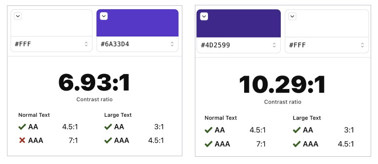
Contrast and focus states met accessibility standards
Semantic elements and consistent roles improved assistive technology support
Solving accessibility once at the system level scaled benefits across all features
Impact
Design & Engineering
Design system usage grew from <30% to ~90% across new projects
Reduced redundant components and rework
Faster, more consistent implementation across teams
Product & Users
Multiple independently built features shipped using 100% design system components
Improved UI consistency contributed to higher perceived ease of use
34% of NPS promoters cited the interface as “easy to use” and “intuitive”
Reflection
Buttons are where intent turns into action. By systemizing them, we didn’t just clean up UI, we stabilized decision-making, reduced friction across teams, and built trust in the design system itself.
This work became the model for scaling other components across the platform.