From Dashboard Clutter to Conversion Lift
Crowdtap rewards members with points for completing brand surveys. For the experience to work, members need to quickly understand what surveys are available, what feels worth their time, and what to do next.
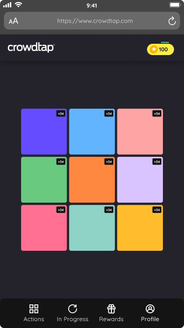
This redesign focused on improving the first-time survey experience while creating a more responsive foundation for future web and app consistency.
Role: Lead UX Designer + Researcher
Company: Suzy
Year: 2022
Consumer-facing survey platform, responsive web

Business Goal
Increase first-time user conversion by reducing friction in the survey discovery and selection experience.
My Role
Lead UX Designer & Researcher
I led:
UX direction
Competitive analysis
Prototyping
Usability testing
Cross-functional collaboration with product and engineering
My focus was to reduce decision fatigue while helping the team move toward a more consistent, scalable product experience.
Research & Discovery
I used user interviews, persona work, usability testing, and competitive analysis to understand what motivated members and where the current dashboard created friction.
User interviews and persona work revealed
Points were a primary motivation for members.
Members often evaluated whether a survey felt worth taking based on the reward value, so points needed to be easier to recognize upfront.
Usability testing revealed
1. High interaction cost
Users had to read through long survey titles and descriptions before deciding what to do.
2. Ineffective filters
Filters exposed limited choices and did not meaningfully help users narrow their options.
3. Overwhelming layout
Large survey blocks made the dashboard feel heavy and crowded.
4. Redundant recommendations
The recommendation area repeatedly surfaced the same limited actions, such as instructions or referrals.
Competitive analysis reinforced
Keep the primary task easy to recognize
Reduce competing choices
Surface value quickly
Use points, progress, or rewards to support motivation
Avoid crowding the dashboard with too many offers or activities
Key insight
Members did not need more information upfront.
They needed clearer value signals — especially points — and a lighter path to choosing their next survey.

Design Strategy & Solutions
The redesign focused on helping members make clearer, more confident survey choices while supporting a more scalable product foundation.
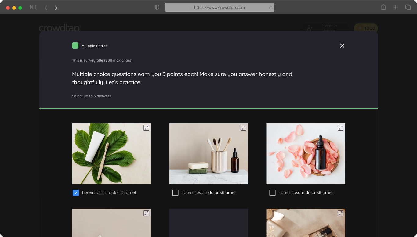
1. Made survey options easier to scan
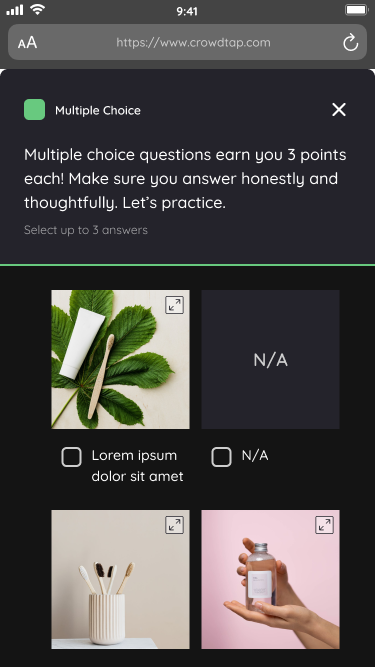
We reduced text density and redesigned survey cards so members could evaluate options more quickly without reading through long descriptions first.
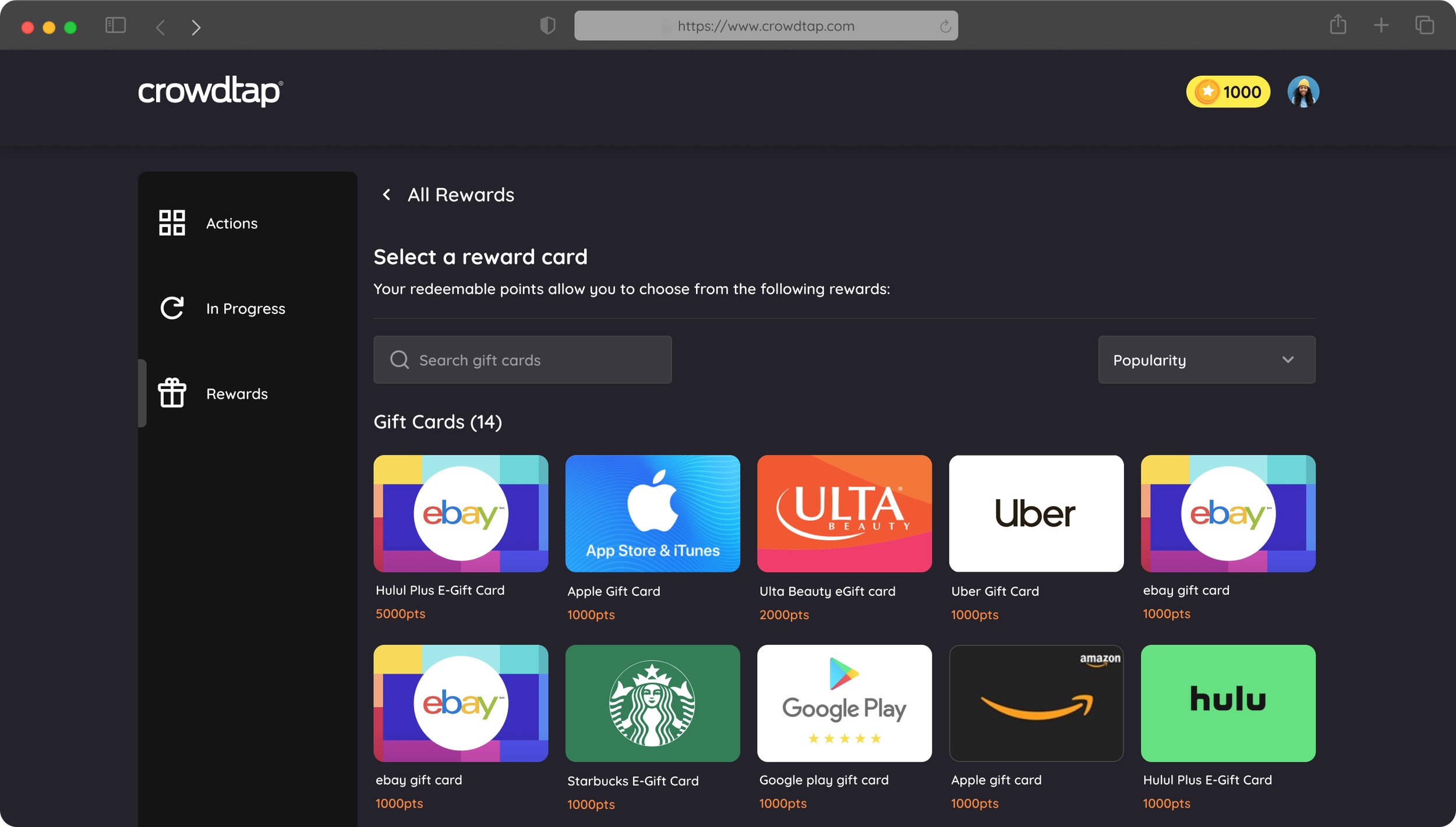
2. Surfaced points as a stronger decision signal
User interviews and persona work showed that points were a primary motivation for taking surveys, so we made reward value easier to recognize upfront.
3. Reduced competing choices
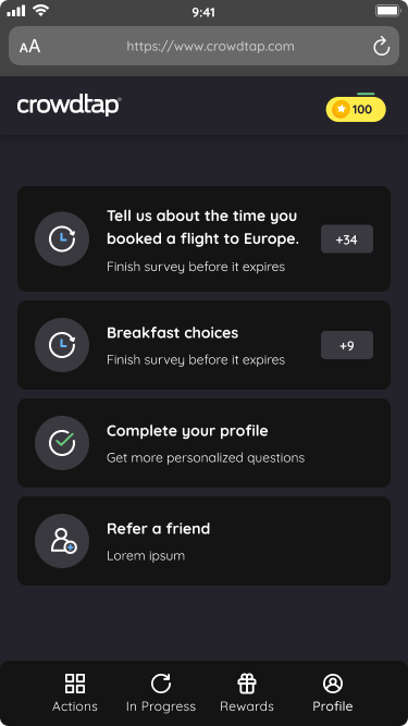
We simplified the dashboard experience so first-time users had fewer distractions and a clearer path to choosing their next survey.
4. Added lightweight reward and progress cues
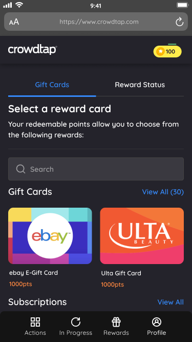
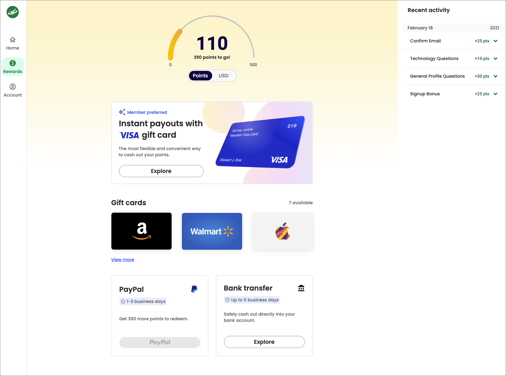
We used points, progress, and reward cues to make participation feel more motivating without distracting from the main task.
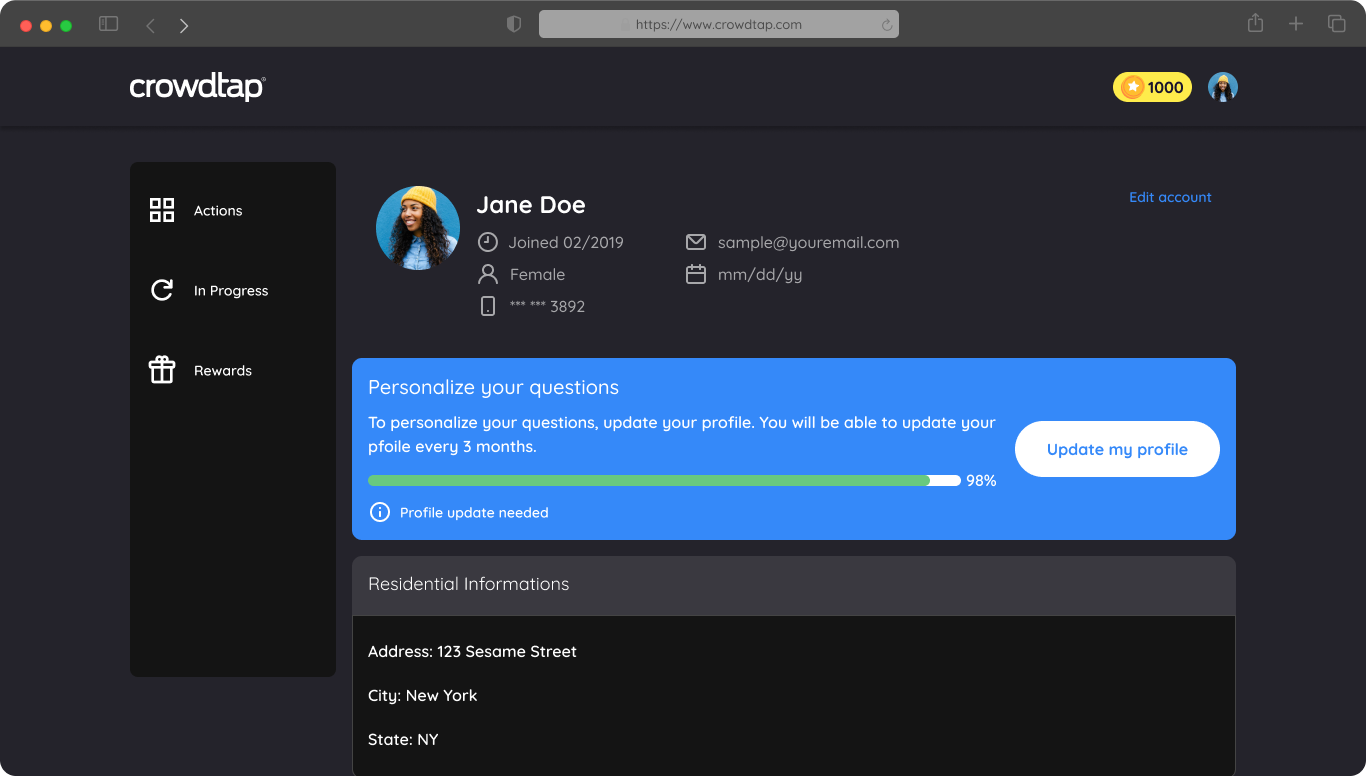
5. Created reusable responsive patterns
We designed survey cards, selection states, responsive layouts, and progress patterns that could scale across web and app experiences.
Tradeoffs
Outcome
+30% increase in first-time user conversion
The redesign helped Crowdtap create a clearer, more modern survey-taking experience while supporting a stronger responsive foundation across web and app.
Impact
Easier survey decision-making
Reduced first-time user overwhelm
Clearer point and reward visibility
More motivating survey selection experience
Stronger foundation for reusable product patterns
Reflection
This project reinforced that improving a dashboard is not always about adding more information.
Sometimes the most valuable design work is removing the right friction so users can understand the value faster.
For Crowdtap, simplifying the experience made survey-taking feel easier, more focused, and more rewarding — while giving the team a scalable foundation to build from.