
From Plan Confusion to Confident Conversion
Company: Verizon
Year: 2018
Role: Senior Product Designer
Focus: UX Design, UI Design, Prototyping, Usability Testing
Tools: Sketch, InVision, Amplitude

Verizon Smart Family helps parents manage their children’s tech usage, monitor activity, and stay connected when apart.
Business Goal
Increase subscription revenue by improving conversion from plan selection to paid subscription.
UX Goal: Help parents clearly compare Regular and Premium, understand the 7-day trial terms, and choose the plan that best fits their needs.
register
members
member)
My Role
I was one of four designers exploring plan selection improvements.
My focus:
Conceptualized side-by-side comparison chart direction
Helped evaluate which structure made plan differences easiest to understand
Initiated simplified copy for scannability
Collaborated with designers exploring tabbed navigation
Partnered with a UI designer to refine visual hierarchy and interaction details
Led team alignment across multiple parallel design directions
Research & Problem Framing
Data showed that users were dropping off at plan selection — a key decision point in onboarding.
To understand why, we conducted remote usability testing with 10 participants across iOS and Android.
We focused on four questions:
Did users understand what each plan included?
Could users tell the difference between Smart Family and Smart Family Premium?
Was the 30-day free trial clear enough?
What information helped or slowed their decision?
What we learned
Plan value was hard to scan
Users could see both plan options, but they struggled to quickly understand the main features, benefits, and differences between them.
Premium’s added value was easy to miss
The original presentation did not clearly separate shared features from upgraded features, making it harder to understand what Premium added beyond the standard plan.
The free trial needed more emphasis
Some users did not realize they would receive a 30-day free trial, which weakened the perceived value of continuing.
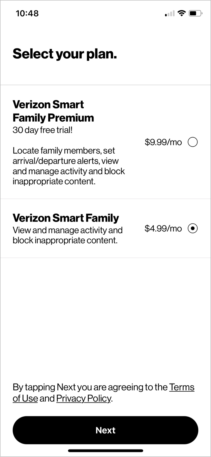
How might we help parents compare Regular and Premium plans with enough clarity to choose the right fit?
Design Exploration
The team explored multiple directions to make plan selection easier to understand.
Plan language was tightened so users could understand feature value more quickly.
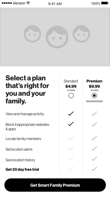
Version 1: Side-by-side comparison chart | A comparison model that placed both plans in one view, using short feature labels and check marks to show what each plan included.
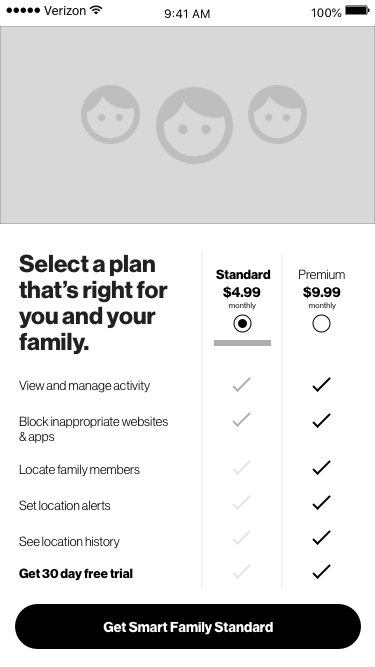
Version 1: Side-by-side comparison chart | Users could review both plans, compare features side by side, and select the option that best fit their needs without leaving the screen.
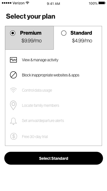
Version 2: Tabbed plan view | A tabbed model that separated the plans into individual views, allowing users to review one plan at a time.
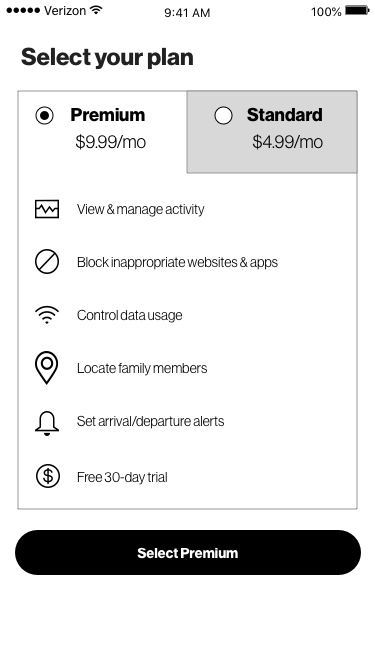
Version 2: Tabbed plan view | Users switched between tabs to compare plan details, then returned to their preferred option to continue with plan selection.
Design Decisions
Show more of the plan value
We expanded the visible feature set so users could better understand what each option included.
Clarify shared vs. upgraded benefits
We used a comparison structure to show which features were included in both plans and which benefits were unique to Premium.
Make the free trial easier to notice
We surfaced the 30-day trial more clearly as part of the plan selection decision.
Reduce comparison effort
We prioritized a layout that allowed users to compare both plans without moving between screens or tabs.
Validation
Both directions were tested with users.
What worked
Users understood how to select a plan
Users found value in the listed features and benefits
Most users selected Premium because the included features were easier to understand
Users could clearly see which features were included or unavailable in each tier
What we learned
Version 2 created more interaction cost. Users spent extra time tapping between tabs to compare plans.
Version 1 performed better because it showed both options at once, making comparison faster and more direct.
“The comparison is clear. I want to try the premium plan because it has all the features I need.”
“I like this because it’s obvious that the grey check marks are not what the 4.99 plan covers.”
Tradeoffs
1. More visible value vs. screen density
Surfacing more benefits made the plans easier to understand, but it also added more information to the screen.
To keep the experience scannable, we relied on short feature labels, clear hierarchy, and simple visual indicators.
2. Lower interaction cost vs. a cleaner single-plan view
The tabbed version created a cleaner view for each individual plan, but it required users to move between tabs to compare options.
Testing showed that this slowed decision-making, so the team chose the comparison chart because both plans were visible at once.
Final Direction
The team selected Version 1: the side-by-side comparison chart.
Why it worked:
Both plans were visible in one view
Shared and upgraded features were easier to compare
Users did not need to tap between tabs
The free trial was clearer at the decision point
Parents could evaluate the plans with less effort
Outcome
The redesign moved plan selection from a narrow feature summary to a clearer comparison model.
It helped parents:
Understand what each plan included
See what Premium added
Recognize the value of the free trial
Move forward with more confidence
Key takeaway:
For purchase decisions, clarity reduces hesitation.