
A leadership case study on designing risk detection, prioritization, and faster intervention into a live research operations dashboard
Role: Director of Product Experience (Strategy + Hands-on UX)
Company: Suzy
Year: 2025
Platform: Internal Web Application
Suzy is a market research platform that helps companies create studies and make better business decisions from consumer feedback, while Crowdtap is the consumer community where people answer surveys and share their opinions.
As live studies moved through the platform, Ops teams needed a faster way to detect risk, prioritize issues, and intervene before problems affected timelines, data quality, or customer trust. This leadership case study focuses on how I helped shape an operational dashboard that turned scattered study signals into clear priorities and actionable insights.
Scattered Signals Became an Operational Bottleneck
When hundreds of live studies were running at once, Ops teams had to piece together system data, client emails, and team knowledge just to understand what needed attention.
Live Research
in Progress
Studies are live and collecting data in real time
Issues Arise
-
Low response incentive
-
Long survey length
-
Too few people qualify
-
Survey errors
-
Data quality risks
Operational Bottleneck
2 Ops team members monitor hundreds of live surveys daily across two disconnected sources
Admin Control
Goal: Understand study health from system data.
-
Monitor live surveys
-
Review performance metrics
-
Spot risk signals
-
Interpret complex data
-
Prioritize urgent issues
-
Use team know-how when the data is unclear
Goal: Understand client-impacting problems from communication.
-
Monitor client emails
-
Detect reported issues
-
Gather missing context
-
Coordinate response
-
Protect customer trust
Risk to Business
-
Timeline delays
-
Data quality risk
-
Customer trust risk
-
Reactive firefighting
The problem was not that data was missing.
It was that the workflow made it hard to quickly understand what mattered, why it was at risk, and what action to take next.

My Role
Bring decision clarity to a time-sensitive workflow
As Director of Product Experience, I helped define what Ops needed to see, understand, and act on.
The goal was to turn a reporting dashboard into a decision tool that helped teams spot risk, prioritize issues, and take action faster.
Define the Decision Model
What information actually helps Ops determine what requires attention?
Help separate urgency signals from supporting context and establish what the dashboard needed to communicate so users could prioritize live studies.
Shape the UX Direction Around Triage
How should the experience support the way Ops actually makes decisions?
Review and critique design explorations against real operational behavior, pushing the dashboard beyond reporting toward a workflow for identifying, understanding, and responding to risk.
Connect Signals to Action
How do we make risk understandable enough for someone to know what to do next?
Guide the experience so status, risk indicators, context, and available actions work together rather than appearing as disconnected data points.
Validate the Model Before Build
Does the proposed workflow actually help Ops make better decisions?
Use structured prototype walkthroughs with core Ops users to test whether they could recognize priority studies, understand the reason for risk, and determine an appropriate next step before engineering investment.
The Solution
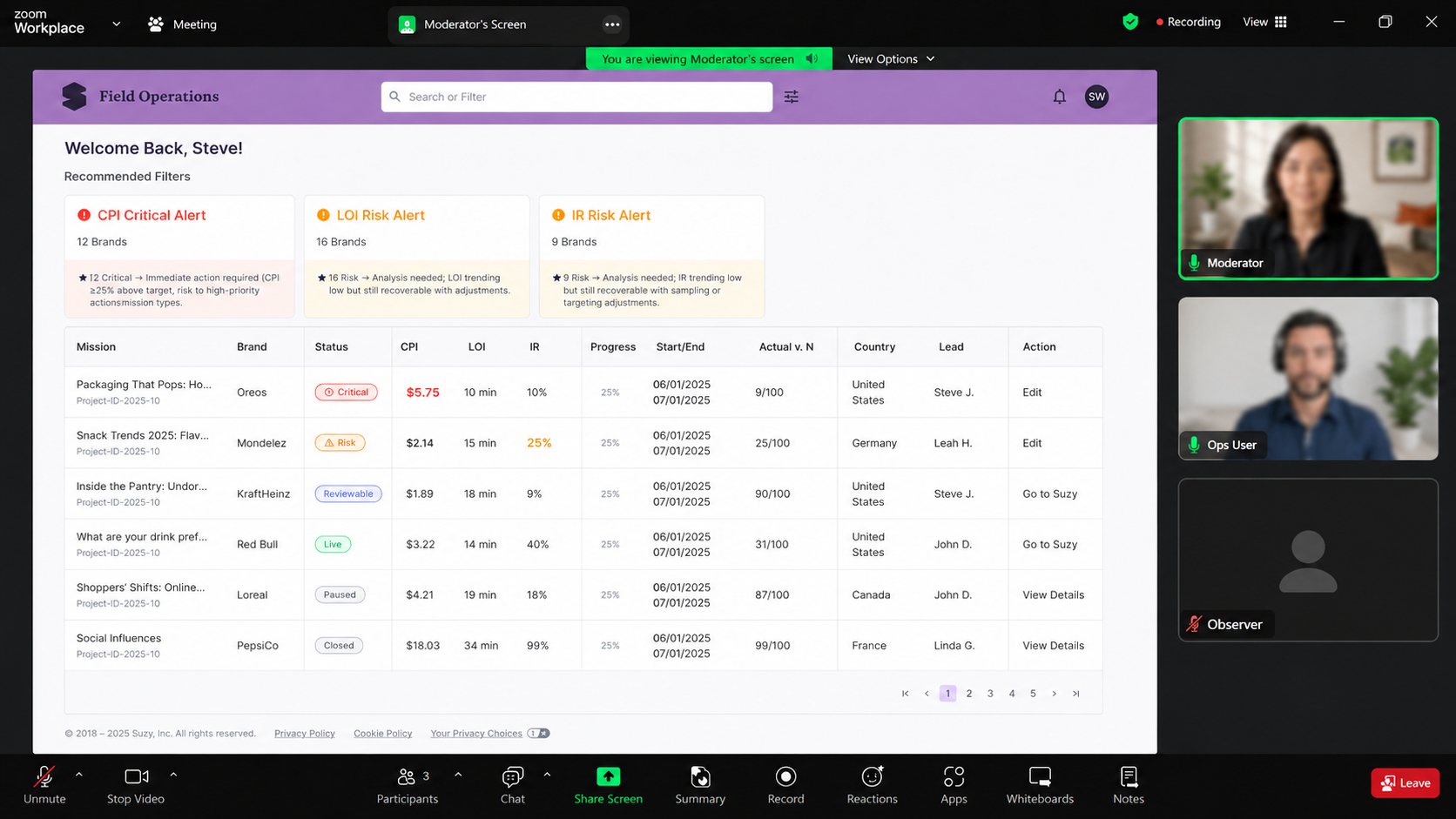
I led the UX direction and partnered with a mid-level designer to mock up a FieldOps dashboard that turned scattered operational signals into a clearer decision-making workflow.
The dashboard helped Ops move from passive monitoring to active triage through five key solution areas:
1. Prioritized Alerts
Recommended filters surfaced the most urgent risk categories first, helping Ops focus attention on studies that were more likely to need intervention.
2. Severity-Based Status
Status labels made it easier to distinguish critical studies, at-risk studies, reviewable issues, and healthy or closed studies.
3. Risk Signals That Explain Why
CPI, LOI, and IR gave Ops a clearer view of why a study might be struggling, such as incentive, survey length, or qualification issues.
4. Progress in Context
Progress, timing, and actual completes helped Ops understand whether a study was on track or trending toward a problem.
5. Clear Next Step
Action-oriented links gave Ops a direct path to edit, investigate, or view details instead of stopping at passive monitoring.
Together, these solution areas helped Ops answer three questions faster: what needs attention, why is it at risk, and what action should we take next?
Validation & learnings
I tested the dashboard with 2 core Ops users through structured walkthroughs to see whether they could quickly assess risk, prioritize issues, and take action.
Key Learnings
Priority indicators worked
Ops could identify which studies needed attention first.
Condensed views reduced scanning effort
Key risk signals were easier to review in one place.
Action guidance mattered
Ops users preferred knowing what to review, adjust, or escalate next.
Feedback prevented build risk
Walkthroughs surfaced logic and workflow gaps before engineering investment.
Tradeoff
Prioritized workflow validation over broad UI exploration
Because this was a focused internal tool for a small Ops team, we moved quickly into a realistic prototype using existing design system components.
That allowed us to test the part that mattered most:
Could Ops see what needed attention?
Could they understand why it was at risk?
Could they act quickly from one dashboard?
This kept the work focused on decision clarity before engineering investment.
Delivery & Takeaways
Where the work landed
Reached concept validation and internal alignment before engineering investment.
What the team gained
A clearer model for how Ops could:
Detect risk earlier
Prioritize urgent studies
Understand why something was at risk
Take action from one dashboard
Why it mattered
The prototype helped validate the workflow before build, reducing the risk of investing in the wrong solution.
Project status
The initiative was paused before implementation due to organizational changes.
Leadership takeaway
Strong UX leadership creates clarity before execution — especially when teams need to make fast, high-stakes operational decisions.